Starbucks’ New Logo
Is it a right choice? The mermaid is now 100% of the logo. From the start, we wanted to recognize and honor the important equities of the iconic Starbucks logo. […]
Starbucks’ New Logo

Is it a right choice? The mermaid is now 100% of the logo.
From the start, we wanted to recognize and honor the important equities of the iconic Starbucks logo. So we broke down the four main parts of the mark – color, shape, typeface and the Siren. After hundreds of explorations, we found the answer in simplicity. Removing the words from the mark, bringing in the green, and taking the Siren out of her ring. For forty years she’s represented coffee, and now she is the star.
Read more here.

Potrebbero Interessarti
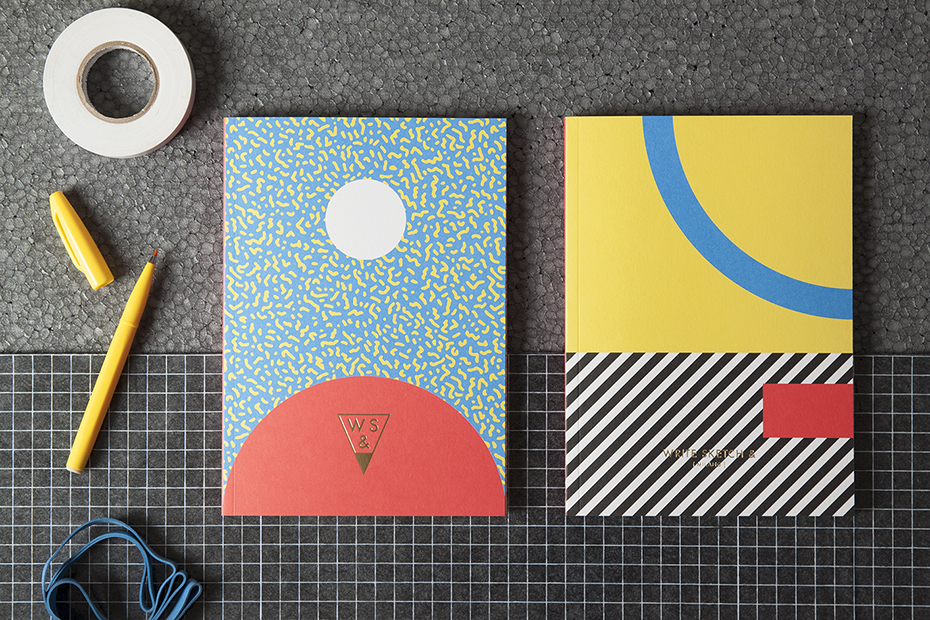
WRITE SKETCH & ?
Founded in 2014 by designers Matteo Carrubba and Angela Tomasoni, already creative directors studio Officemilano, Write Sketch & creates high quality stationery products, with a tradition-bound Italian production and an […]
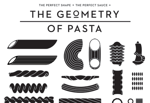
The Geometry of Pasta
La gamma di prodotti The Geometry of Pasta è ispirata dalla preoccupazione, abbastanza italiana, di trovare il formato giusto di pasta da accompagnare alla giusta salsa. Come molti sapranno, (magari […]
Ultimi Articoli
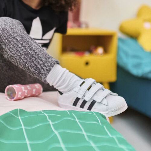
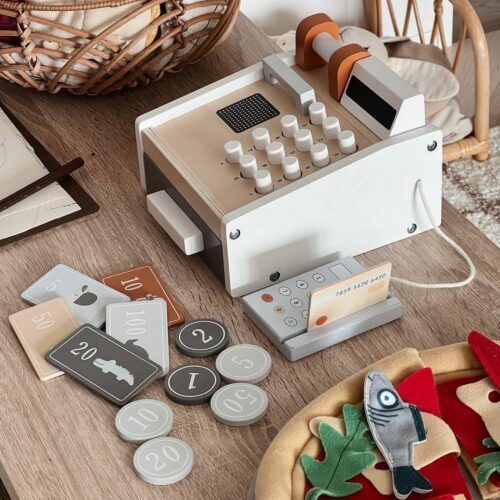
Un Viaggio nel Mondo del Design per Bambini con NOUI NOUI
Quando praticità e stile si fondono armoniosamente…